
Redesign 'Style Quiz'
Redesign 'Style Quiz'
@ Collov.com
My role:
-
UI/UX Designer
-
UX Researcher
-
Illustrator
Type:
Work Project
(In progress)
Time:
12.2020-03.2021
Team:
-
Product Manager
-
Market Team (3)
-
Engineer Team (2)
Background
The style quiz is the main way for engaging users with our furniture & designs. It helps users find their style and now has a 1.6% conversion rate in this funnel. As part of the continuous work to improve conversion rate, this project was expected to contribute to the growth in the long term.
What makes the 32% drop off?
From 30 effective feedback & 980 visits in this funnel observed from Mouseflow:
Not in mood:
80%
of visitors felt they were just looking around, rather than have a clear goal of buying.
Vague aim:
73%
of visitors started the quiz without a clear mind of an aimed space.
Distraction:
37%
of mouse moves were hanging around the top menu and other contents on the page during the test.

Indirect instruction:
Actual scene pictures will cause more effort to recognize the image contents, especially in small-scale pictures.
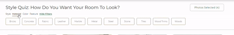
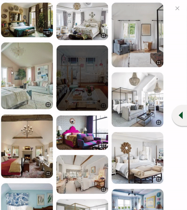
Room Page

Distractive Sections:
Extra unrelated content are distracting users when they are taking the quiz will cause a Bouncing Fiction Experience (Users might jump through the link, and go back).
Extra unrelated contents
Conclusion:
Most users tend to define the 'Style Quiz' as an exploration section rather than a pre-process of a serious purchase, they are still rambling in the website, they even have no idea about which space to improve. Instead of pushing them to make a decision, we will spark them, inspire them, and encourage them to keep exploring.
Design Solution
01
Isolate quiz process, reduce distractions.
02
Minimize the visual elements, make the content less confusing.
03
Give "not sure yet" option, encourage users to finish the quiz process even they are not sure yet.

What makes the 48% drop off?
From 283 visitors that willing to stay on this page yet still dropped, we found (observed on Mouseflow):
High Fiction Experience:
57%
of dropped visitors had experienced high fiction experience.
Bouncing & Click-Rage:
81%
of Fiction Experience involved Bouncing (Navigate back and forth), Click-Rage (Massive click in short period time), or both.
Low user engagement:
65%
of all visitors have never scrolled down 3 screens.
Insight:
1. The view cannot give demand info to users.
2. Users spike many repeat operations while navigating.
2. Users have limited interest in navigating the long content.
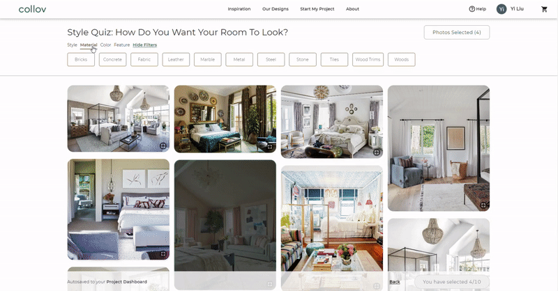
Room Page
Excessive operations
Users need to click too many times to navigate the menus.
(High fiction experience)


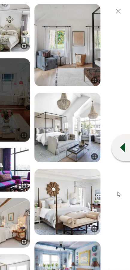
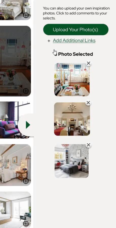
Sidebar visual overload:
The sidebar added a visual cluster to the whole view.
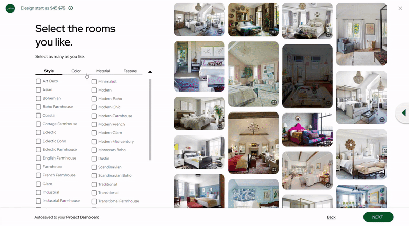
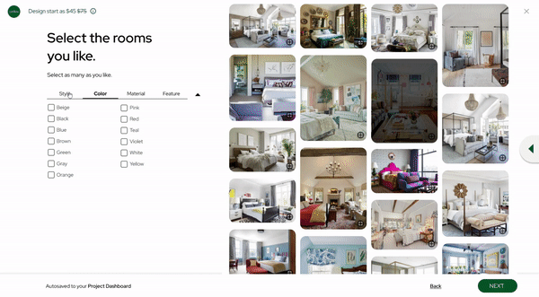
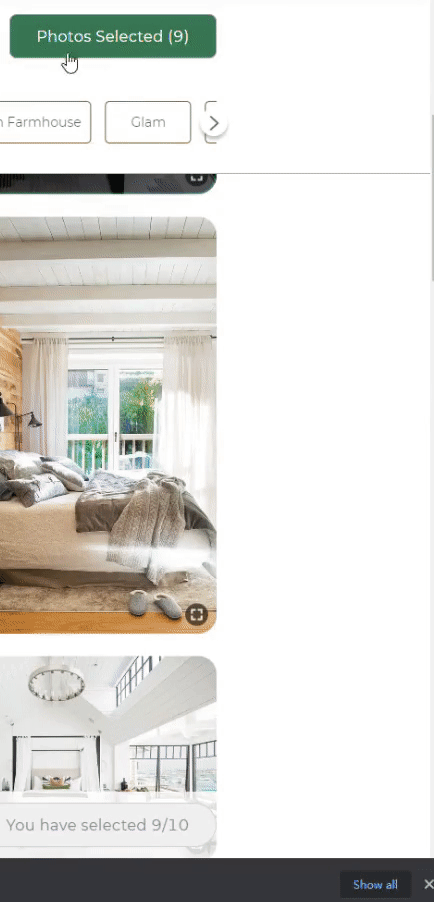
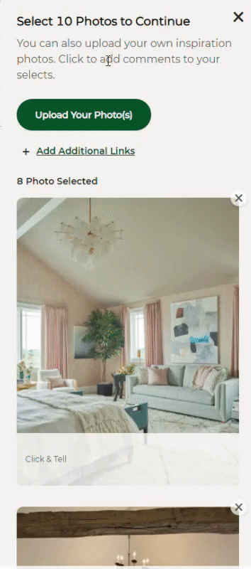
Mandatory Selection:
Users need to mandatorily select 10 pics cost to navigate 2 sets of designs on average, yet only 35% of total visitors are willing to view 3 screens of pictures.

Crowd view space:
The UI elements are squeezing too much space of the major contents.
Each time you select a picture, the sidebar pops out, covers even more main contents.
Design Goals
01
Reorganize the screen view, maximize the main operation area.
02
Smooth the menu operation & navigation experience.
03
Give the view a hirearchy, to reduce visual load.
Design Solution

01
Reorganize the screen layout
Maximize the main operation area, make the view fits the nature of horizontal navigation.
02
Reduce excessive clicks
Offer a full option view for users to reduce excessive navigational operations.
Old navigation
New navigation
03
Smooth slide-bar interaction
Replace the trigger button with a slide element, fit the instinctive cognition, also give options to collapse the bar by clicking any space outside.
Old slide bar interaction
New slide bar interaction
04
Smooth 'Edit Selected Pic' operation
Reduce navigation length by reducing the thumbnails into small sizes; Give 'next' & 'back' to quickly switch between pics; highlight the panel when operating, avoid distractions.
Old design
New design
05
Indicator Interactions
Give users interactive & instant feedback when they finish every selection.
After Design
What I learnt
Using Fiction Scores to determine what jeopardizes a smooth UX.
Friction experiences will especially wear down users' patience when they need to stay and operate the user panel for a while. It's a new system to help UXD/UXR to find what might break users' mind flow.
Aim intermediate user group to increase the conversion rate.
Define a user group that can bring the biggest conversion rate. The intermediate user group has the most possibility to convert. (User groups are divided by interest level) We found them by filtering pages they visited. When new users show the intent to stay and had navigate more than 3 pages, we define them as intermediate users.
Simulating the very instinctive behaviors can bring a nice experience.
Object affordances play an important fact when we cognize the use of a thing. Like buttons, slides, we instinctively know how to interact with them. Using proper affordance language can save visual information to the most important things.