
LingoAce Mobile App UX Design
@ LingoAce
My role:
-
Solo Product Designer
-
Visual Designer
Type:
Work Project
(In-develope)
Time:
Jul 2022 - Mar 2023
Team:
-
Head of Brand (1)
-
PM Lead (1)
-
PM (1)
-
Engineer Lead (1)
-
Engineer Team (5)
-
Market Team (?)
Background

Motivation: Expand the oversea market
LingoAce is an edu-tech company established @2017 in Signapore. It snowballed during the pandemic. @2022, LingoAce wants to expand the overseas market thus it wants to upgrade its brand identity, visual, and user experience on its digital products on its 2C side of digital products, to make it a world-class company.
Design Mobile & Tablet App, and Design System
As the new Mobile/Tablet design received very positive feedback from customers and the internal team, our product team asked me to make a design system based on the new design to extend that to other platforms.
Because it's a big project involving UX research, UX design, visual design, design system design, responsive design, and material design, I will divide it into 3 parts on the website.

Mobile App UX Design
Large Scale · Solo Project · iOS/Android · EduTech · 2C · SaaS · Product Design · Visual Design · 2022-2023
Narrow Down Design Tasks
Where we should start the project? Here is what I've done to narrow down the board goal into actual design tasks:
Start the project with audits
At that time, I had recently joined the company. So, I took the opportunity to audit our competitors' products and the company's existing products, to offer a fresh eye critique.
I listed all the areas that I believed could be improved, compiled them in a report, and hosted workshops with the team to see if my assumption was valid.
Picture: Reports on competitor audit & current product audits.

Based on the team’s feedback I got several directions to explore. Though they don't stand for users, it's enough to kick off the project.
Then, as the project progressed and with a growing understanding of the users, I gradually identified more user needs and worked on solutions. By the time the project was delivered, we had accumulated 12 PRDs, introduced a new functional panel, revamped two major functional areas, optimized three major flows, and made countless minor improvements down to individual icons and interactions. The entire user experience across all pages was refined.
Below, I will list some aspects that I believe would make suitable case studies to share:
**Though there are many flows changed, to cut the reading length, I will only list 1 flow that better demonstrates my UX research/design process here.
I'm more than happy to walk through more details if you're interested. Just DM me with an email.
Optimize the Class Booking Experience
Motivation
The booking flow is the most important way to consume class points and the major conversion channel of the app. So we all decided to prioritize this flow ahead.
Research resources
While we have formal questionnaires and interviews, I prefer some ad-hoc user research. This allows users to relax, and in casual interactions, they often reveal deeper needs unintentionally.
In this research, I gained many insights through offline events organized by the company, where I interacted with parents, children, and teachers.
These offline events offered free classes to students, so many parents would download our app during the event to schedule classes. Whenever this happened, I would engage in random conversations and observe their reactions during the booking process.


What I found in the current flow
The current flow: 5 steps


Users keep clicking ‘Schedule’ to start booking
When parents hear about 'book classes', they instinctively look for a calendar.
A significant number of parents tend to pause briefly and then try clicking on the 'Schedule'. However, this 'Schedule' button is only for viewing the existing class.
Initially, we thought this confusion was due to the term 'Schedule,' which implied booking, misleading users. We later changed it to 'Calendar,' but many parents still clicked on this section.
Users keep seeking a calendar view for reference
In further observations, I even noticed that parents, during the second step of selecting a teacher's time slot, would sometimes click on the 'Calendar.'
Users sometimes even exit the app and check their Google Calendar to verify their and their child's availability before they make the decision.
It seems that giving a calendar view can help them reduce the uncertainty of going through the next step.
Users expect direct slots after selecting a teacher
Many users mentioned that they've already picked a teacher at this step. However, the first view of the screen is still showing the teacher’s bio.
Hard to refer to an exact day when users scroll deeper
When the screen scrolls down, it’s hard to make users refer to an exact date because there isn't a month or year reference on this panel. They might accidentally select a slot that belongs to the next month.
It causes back-and-forth efforts to confirm with the time.
It’s hard to find scattered slots in a big panel
Sometimes when the teacher's slot is tense, users need to scroll a large area to find available slots.
Users need too much effort to calculate the class cycle
When selecting multiple classes, parents are asked to choose the start and end dates for the class cycle.
Many parents get stuck at this point because it takes too much effort to calculate.
Furthermore, since our system operates on a points-based course consumption model, if they haven't made precise calculations, they often end up with some remaining credits. As a result, they need to go through the booking process again to utilize the remaining class points.
In fact, parents are not actually concerned about the start and end dates; their primary intention is to consume class points. The end date is merely a rough time reference for users.
User expect a next step on this flow
After completing the booking, the interface remains on the teacher's time slots, causing confusion for many new users.
They often ask, 'What's the next step?' or 'Where can I view my classes?'
Even returning users need to click 'back' to access the calendar interface where they can see their scheduled classes.
Conduct research results to design solutions
According to the research, we can see during the booking process, users keep seeking for a time reference. Start booking from a program is counterintuitive. After completing the booking, the interface remains on the teacher's time slots, causing confusion for many new users.
They often ask, 'What's the next step?' or 'Where can I view my classes?'
Even returning users need to click 'back' to access the calendar interface where they can see their scheduled classes.
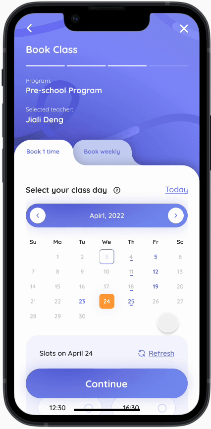
The current flow: 4 steps

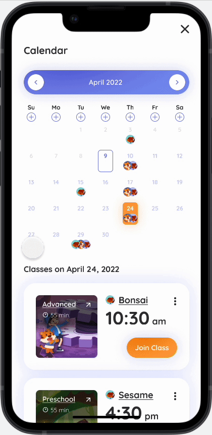
Start from calendar
Starting the booking process from the calendar also increased user confidence and significantly reduced the need to navigate external time tools, improving app retention.
Multiple student status in 1panel
In response to parents' feedback, we unified student management on the calendar, eliminating the operation of switching between student profiles.
More conversion points
We also added conversion points below the calendar to boost purchases.
Scroll effect of calendar

Search specific teachers
Many parents come to us through referrals from other parents, so they often have a specific teacher in mind when making their choice. The search function helps them quickly locate and select their desired teacher.
Glanceable time slots
Previously, users had to scroll through a long time bar to find a suitable class time. In our new design, we simplify the process by directly displaying available time slots, making it convenient and saving screen space. Users can now easily associate dates and times for quicker selections.
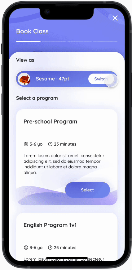
-1 Step
The selection page directly links time and teachers, allowing users to quickly choose a time on the second page, eliminating a step in the process.
Favorite teachers & Recommend teachers In 1 view
We remember users' choices and intelligently assist them in sorting their preferred and recommended teachers. This helps parents make quicker decisions without the need to switch and search for teachers they've saved previously, as was the case before.


+ Optional weekly booking without breaking the experience
By default, they will confirm the booking slot at this step. Still, users can add more weekly slots by consuming their class points. Click the '+' symbol to view the teacher's availability.
Help users make quick decisions
Returning to the core purpose of the process: to help users consume their class points. Instead of complex calculations, we help them determine the end date for point utilization, enabling quick decisions.
Book 1 class as default
Users who don't want to add more classes can continue to use this flow as a regular confirmation page to book a single class.
Calendar reference
Combining optional weekdays with time slots visually establishes a direct connection, enabling users to make confident and swift selections.
Auto-calculate the final class day
Assisting users in estimating the approximate end date of this purchase circle based on the selected frequency of classes and point consumption.

Further guidance to the next step
Users often ask, 'What's next?' or 'Where can I view my classes?' after the booking.
Therefore we added a further step to continue the flow and guide users to be prepared for the class.
Tells where the booked class goes
The most common user's expectation is to view the classes they just booked. So we made the 'Check calendar' the main CTA of this page.
Smoothen the whole UX
Despite UX flows and functional logic, I also made a series of changes to smooth the whole experience based on many fragmented user feedback I collected.
Brought the Assignment into a independent panel
One of the most frequently used functions is doing Assignments and Checking Assignment reports. Most users only use the 'attend class' feature once or twice a week, while the 'homework' feature is used 5-6 times.
However, it only can be directly accessed through the Home page. If users want to check the assignment status and results or reports, they will need to go through 3 steps to reach it:
history -> select class -> select assignment-> specific assignment.
Users has to cross 3 steps to reach the report

This creates a significant disconnect for users, especially new ones. So we decided to put the assignment as an independent panel so users can directly access each assignment type and its report, meanwhile, we keep the direct assignment access from the Home page.
Keep the direct assignment access from the Home page.

Direct assignment panel and its 2 sub-pages.

Sort all functions and give users right expactations
Because users typically use our product only once or twice a week (sometimes even less), they become less familiar with the App during extended periods of inactivity. It's common for them to completely forget what is what, leading to repetitive attempts to access these function groups to find what they're looking for.
In the new design, we expanded the functions within these collections and added annotations to them. This way, when users click on them, they have a more accurate expectation, and the functions they're seeking become more readily visible and accessible.
Old Design:


New Design:
Fill the incomplete flow
There were many incomplete flows that confused users and shut down the experience flow. Users will jump out of the flow if they don't get enough guidance for the next steps.
So to keep a retention rate, we connect the flows with further steps guidance, and explorations. So that users will stay in the app as long as possible.
Old version: There's no further step, no action call on the flow

New version: Give clear instructions on what happend, what is next

Give elaborations on confusing parts
Grandparents always complain that they don't know how to use the app, I've tried my best to offer as clear instructions as possible.
For the terms that look strange, and UIs that look complex, give an instruction to shorten the recognition process.
Instructions on confusing & complex sections


Sturctualize the app with Visual
A systematic problem
The existing app has many accessibility problems and the visual is messy. The visual elements cannot help users digest information, on the contrary, they create lots of visual noise and distract user's attention.
Seizing the opportunity to enhance the user experience (BX), I proposed adopting a new visual language and systematizing our visual elements. This approach enabled consistency and improved cohesion throughout the entire app.
To cut the reading length, I've separated the visual into a separate case study (View project ↗). I'm showcasing only a few examples related to enhancing the user experience.
Use visual layout to demonstrate logic relationships

Form a consistent cognitive pattern


More accurate UI & interaction


Smoothen the interaction
Drag & iPad scroll
To view more of the optimized visual experience, click here: View project ↗.
Summary
The entire project was initially focused on visual changes, but throughout the process, I identified numerous opportunities for improving the user experience, most of which were incorporated as I gained a deeper understanding of our users. By the time we concluded, we had made countless improvements.
Listing just the representative ones would take up a significant amount of space. Therefore instead of detailing the conventional wireframe-to-high-fidelity process, I directly showcased the before-and-after design comparisons.
This project was extensive and demanding, but it was also incredibly rewarding, and I learned a great deal along the way. It's currently in development, and I plan to provide another update once the project goes live.


