
Redesign mobile landing page
@ Collov.com
My role:
-
Sole Designer
-
UX Researcher
-
Illustrator
Type:
Work Project
Duration:
10.2020-03.2021
Team:
-
Product Manager
-
Market Team (3)
-
Engineer Team (2)
Background
This project aims to improve user engagement and increase the conversion rate while keeping their origin web style. I'm leading to diagnose problems by observing the data and making UX/UI design updates.
Case study is listed in the sequence of "locate problem", "solution", and "impact".
Locate Problems
Aimed Users Group
For all visitors:
90% of them are first-time visitors.
77% of first-time visitors via mobile device.
25% of first-time visitors registered.
10% of new registers purchased.
We aimed to enhance the biggest user group's experience. From our current users' purchase proportion, we found there is still a huge space to develop the mobile experience of first-time visitors.
Research Discovery
From 17.7k screen records, and collected 100 pieces of feedback via Mouseflow, we observed some prominent problems:
Navigation:
67%
of first-time users give up reading the introduction section at the very beginning.
Information:
32%
of first-time users found it too much effort to learn about the website from the introduction section.
cognition:
38%
of first-time users have no idea about the 3D Home Design (one of the core features) feature after navigating the home page.
Major Problem
For first-time visitors, it's quite important to help them quickly cognize the product. But the research indicates this page is failed to effectively convey information to users.

View Rate
Attention
Interaction
Inadequate head info
99.9% of users view,
27.6s average view time,
5.8s average engagement time is given in the head section.
The head section should contain more information and gives a general cognition of the website.
Confusing cognitive logic
67% view rate dropped here,
64% of attention lost in this section.
The introduction rushes to tell users about "how it works," it skipped the most important information"what it is." Users have limited interest on details about how the website actually runs before they know what the website about.
Excessive reading load
40s are spent on average if a user wants to go over the whole cognition section.
Feature introductions are too long to read. Without intuitive media, it will take too much effort to learn the information.
Low discoverability
55% of users who navigated to this section have interests to interact with this section.
However, information like design cases was tested that drives user engagement is hidden like an uninteractable picture at the middle of the page.
Redundant navigation loads
35% of page contents are supplement contents (e.g. partners, footer, policy, etc.) should take less space and be distinct from the main contents so that users can get a clear signal to stop reading when reaching the unimportant contents.
If a user navigates to the bottom and finds the contents are not that helpful, he will feel frustrated.
Improvement Process
Define Design Goals
To improve the education section for a first-time visitor. I divided the user journey into 3 stages. Each stage has its own design goals and content strategy respectively.
Cognition Stage
_edited_ed.png)
What's this?
User's mental model
INTRODUCE
ATRACT
SPECIFIC
Tell users who we are, how we can make difference. Define the most valuable thing about our product. Make sure the contents are glanceable.
Design Goals
Exploration Stage
_edited_ed.png)
What I can do?
SET TASK
GUIDE
INTERACT
Set a flow to lead users to experience the product, Ensure users can operate the process as smoothly as possible.
Action Stage
_edited_ed.png)
There we go!
CONNECT
ADVERTISE
SELL
Establish relationships with users, encourage activities like subscribe, register, purchase, etc.
Reorg Info Display (Content Strategy)
The average engagement time that users spend on different types of information are:
40s on cognitive info, 7s on exploration info, 3.5s on CTA info, and only 0.2s on supplement info.
However, based on the proportion of the information type, we can easily find that
Information type proportion:

Info type ranged by engagement time:

Cognitive Info
Exploration Info
CTA Info
Suplement Info
The cognitive info took too long to read,
The supplement info took too much space and had little attraction.
The exploration info attached users the most yet it only takes a small proportion of the whole page.
Thus we will adjust the info components as below:
Prioritize the information type that attracts users' attention the most. Increase this type of information to encourage users to engage with those contents they have more interest in.

Old Design

New Design
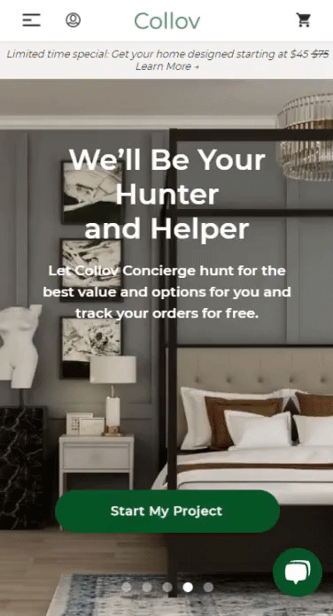
Exploit head info board
99.9% of users view,
27.6s average view time,
5.8s average engagement time is given in the head section.
The head section occupies the most attention.
To utilize this attention weight, I put more info in the head section. Introducing important features to it, to help users quickly scan the contents.
Old Design


New Design

Emphasis the main point
reading length was reduced. Expend info with "+" only when viewers want to read.
Scrolling brands info
Brand info will be horizontally scrolled. So that viewers can navigate the whole brand info and avoid reading that long.
Compress info display
70% of reading length was reduced. Expend info with "+" only when viewers want to read.
Redesign Medias & contents

Design the new illustrations
In our questionnaire, 65% of users had reported the illustration was too abstract. As the only designer of this project, I also designed the new set of illustrations according to existing styles in Corel Draw.
Old Design

New Design

Shorten the instruction length
30% of the reading length was cut. Use higher stage-based description instead of introducing technical terms, make user easier cognize the process.
Optional extensive info
For users that need more introduction info or prefer video media, offer optional tutorials while not occupying too much space.
Redraw the illustrations
The original illustration was reported as too abstract. Users need extra efforts to cognize the visual contents. So I draw a new set of illustrations to clarify the process.
Encourage Exploration
Old Design

New Design

Set core features to three different explorable sections
Encourage users to explore abound functions, help them cognize more about our core features.
A proper section name
For each section, always give a word from the users’ perspective to understand the purpose of this section.
Give direct access to awesome features!
Add some direct “try space” to encourage users to play around the space, so they can pick up & purchase furniture directly. (No need to purchase the design first)
After Design
Design Impact
From two weeks after launching the new page, we found user's satisfaction and engagement have successfully increased.
From 18 effective feedback & 2.1k new visits:
Navigation:
17%
of first-time users give up reading the introduction section at the very beginning, drop from 67%
Information:
5%
of first-time users found it too much effort to learn about the website from introduction section, drop from 32%
cognition:
8%
of old users have no idea about the 3D Home Design feature (one of the core features),
drop from 38%
Conversion Rate Increase:
Total 37% of new visitors registered increased from 25%.
15% of new register purchased increased from 10%.
+48%
+33%
What I learnt
The information structure and storytelling experience of a web product play an important role in first-time visits. An easy-cognizable flow is especially crucial in this experience.
Analytic tool (GA4) only tracks data on pageviews and purchase behaviors. However, it gives limited info that shows users' activities on the web product interface to optimize product design.
I learned how to use heat map tracking tools to observe direct user reactions on the website. I found my interest in this type of research & design project because it allowed me to take a closer look at real user reactions. Compared with in-person interviews & questionnaires that contain lots of subjective perspectives, the data we collected from usability testing tools allowed me to see the most straightforward feedback.
I would really like to work more on this type of project in the future.