
Visual Design & Material Design
@ LingoAce
My role:
-
Solo Product Designer
-
Visual Designer
-
Graphic Designer
-
Illustrator
-
Animator
-
Motion Designer
Type:
Work Project
(In-progress)
Time:
Jul 2022 - Current
Team:
-
Head of Brand (1)
-
PM Lead (1)
-
PM (1)
-
Engineer Lead (1)
-
Engineer Team (5)
-
Market Team (?)
Background

Expand the oversea market
LingoAce is a edu-tech company established @2017. It grew rapidly during the pandemic. @2022, LingoAce wants to expand the oversea's market thus it wants to upgrade its brand identity, visual, user experience on its digital products.
Design Mobile & Tablet App, and Design System
As the new Mobile/Tablet design received very positive feedback from customers and the internal team, our product team asked me to make a design system based on the new design to extend that to other platforms.
Because it's a big project involving UX research, UX design, visual design, design system design, responsive design, and material design, I will divide it into 3 parts on the website.

Visual & Material Design
Visual · Design System · Motion · Graphics · Interaction · Materials · Mobile · 2023
A 'functional' Visual System
A good chance to solve systematic problems
The existing app has many accessibility problems, and the visual elements cannot help users digest information, on the contrary, they create lots of visual noise and distract user's attention.
Seizing the opportunity to enhance the user experience (BX), I proposed adopting a new visual language and systematizing our visual elements. This approach enabled consistency and improved cohesion throughout the entire app.
The whole view is creating visual noise to users

Interaction is not clear.
Contents are way too small to read.
Too many pure decorative elements. Visual elements should be functional and help users digest info, not confuses users.
Color elements were used in a similar frequency, it distracts users and create visual cluster.
The color cyan & orange only got a 1.6 & 2.2 score in accessibility testing.
It doesn't suit for using a background or a button.
Due to responsive problems (it uses hard scale to fit screen instead of adaptive designs), when the screen is less than 414px in width, the fonts become very hard to read.
Contents are way too small to read.
12 font styles, 6 buttons styles are used in the same main panel and used as different functional contents (buttons and texts). Users will need more efforts to distinguish what is what.
Readability & accessibility issue.
Example 2: Inconsistent and confusing interactions

The tittle fonts/cancel fonts/option fonts and the selected/unselected status are not distinguished.
The formats are not consistent either.

After click, the button become an unelectable indicator, it mixs the functions in same space. Users will get confused after operation.
Visual Exploration
Vote the visual direction on Low-Fi
The visual design was selected through a voting process. After confirming the wireframes, I collaborated with a bunch of stakeholders, parents, and children to vote on several design options.
While some initially favored flashy decorations to capture attention, I found that when I asked them to quickly identify functions and structures on the interface, a high-contrast, structurally clear design helped users read information and recognize logic more effectively.
1st iteration

2nd iteration


Sturctualize the app with Visual
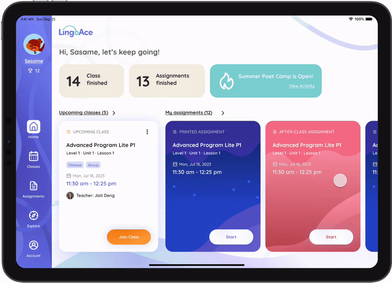
Increase information conversion efficiency
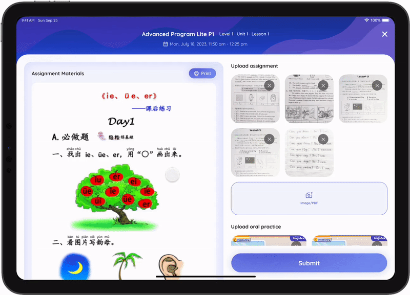
I hierarchically organized all elements in terms of visuals and layouts, including between screens, within individual pages, and information within page cards.
Additionally, I functionalized all visual elements, reducing visual noise. This enables users to focus on the content itself, facilitating intuitive information scanning instead of bandwidth-intensive reading and significantly increasing information conversion efficiency.
Hierarchy between screens
Screen levels distinguised by color weights

Hierarchy in-between a page
Page functional level & info hierarchy that distinguished by layout

Hierarchy in-between a card

Logic relationhip in-between information
Use the visual layout to establish the logical relationship between each section and element.
Old Design:

New Design: information hierarchy distinguished by visual layout

Form a consistent cognitive pattern
Use colors to indicate a type of info
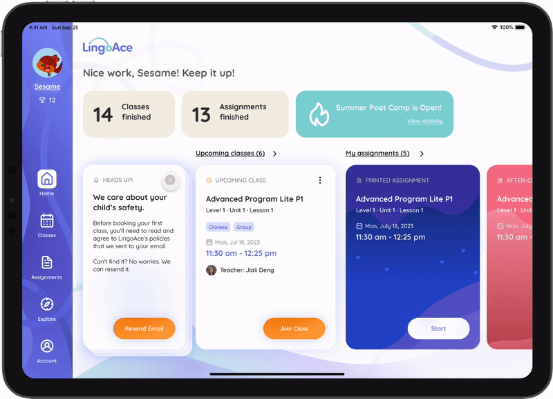
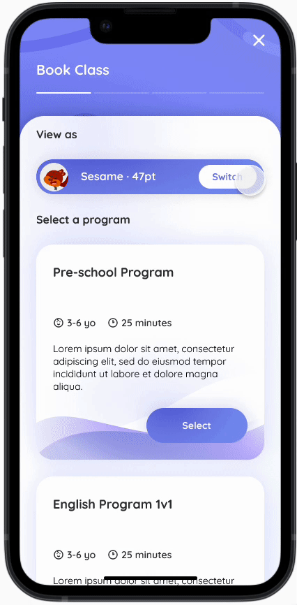
All cards, whether for information or functions, are consistently placed. This fosters a recognizable pattern for users, facilitating quick comprehension during scanning. Using fixed colors to represent card types aids rapid identification, making it easy for users to re-engage with the app after periods of inactivity and adapt to different platforms.
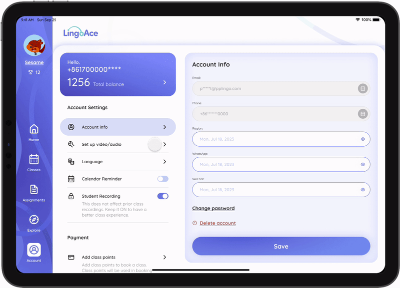
Cards from mobile & tablet apps


Example: Use brand colors to distinguish different programs and assignments.


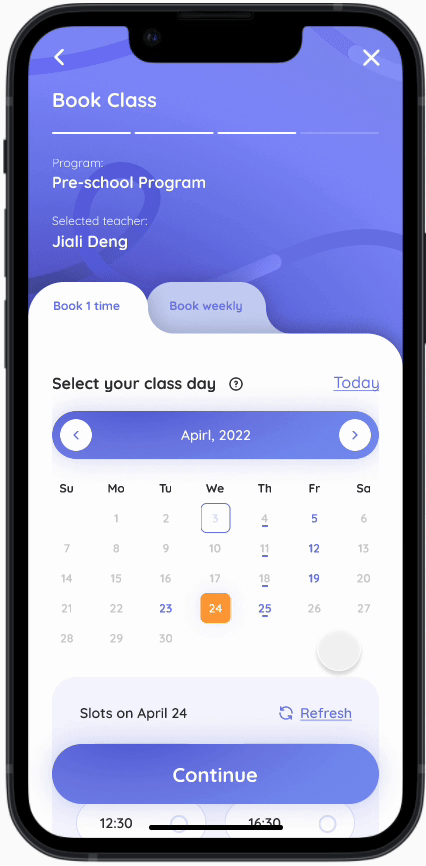
Responsive Design
To view more of the responsive design, click here: View project ↗.
Mimic real physical experience
Motion Designs
Simulating real-world physical interactions can help users intuitively understand the logic and interactions between components, as well as pace their information absorption. In this update, I incorporated numerous motion designs to guide users in understanding the app's functionality and to align the app with trendy aesthetics.
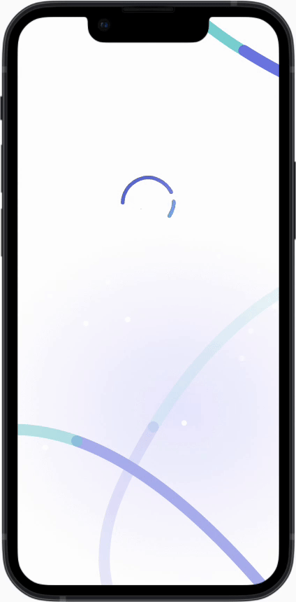
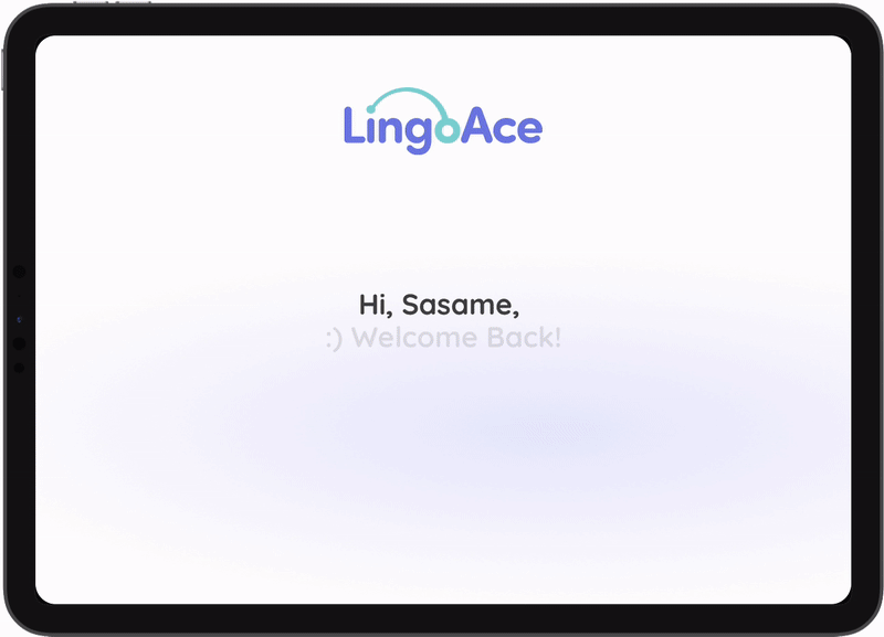
Example 1: Splash screens
Example 2: Home - scroll interaction

Example 3: Scroll interaction
Example 4: Drag & iPad scroll
Example 5: HeadsUp cards

Deliver full set of Material Design
Summarized and delivered a Design System
200+
Icons
22
Font styles
17
Illustrations
28
Color styles
23
Interaction
Patterns
4
Animes
I organized the whole design file, and collected all the 200+ icons, 28 colors, styles of buttons, 22 fonts, and 23 cross-platform interaction patterns (fill boxes, toggles, selectors, etc.) into a Responsive Design System File and delivered them to our developers (View Project ↗).
Select a suitable Font
From the brand fonts (Quicksand, Sofia Pro Soft) and a suggested font used by the web, we voted 'Quicksand' as our app fonts cos the metrics below:
Selected Fonts metrics


Compare fonts with their abilities to present a hierarchy

Compare fonts with their readability

More accurate UI
Using more descriptive icons and acturate UI to help users recognize the info faster. Based on an open source round-corner set of icon sets (Lowdi-Wireframe Kit), I also create 26 icons to make each action more descriptive, more specific.
Assignment & assignment actions

Icon from scratch

More accurate interactions
Selection actions

Backward navigation actions

Use accessible colors
Most of our brand colors got low scores in the accessibility testing. So we have to modified the color to fit them into digital product sense. With the subtle gradients we can add a little contrast on the colors meanwhile not break the brand experience.
Fix accessibility before & after

Designed, maintain and managed the design team's file


Illustrations & Animations
In the small team, we don't have that much of resources, so my previous skills in the digital design can help. Whenever the app needs some illustrations, or animations, I will do my best to support the team and push the process forward.
Illustrate in-app illustrations
Based on our character brand guide, I also illustrate some of the illustrations for our app, for certain notification screens, I made two tones to satisfy a more subtle view.
Example: 2 color tones apply to different scenarios


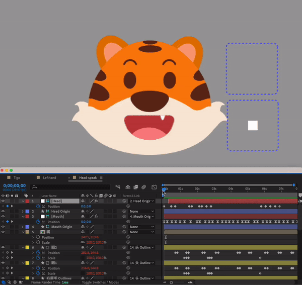
Design and make anime in After Effect
Here is a couple of animations I made for my team to prototype an AI Bot. I used a plug-in called Joystick 'n Sliders to make the sketch and generate the animation.
Example 1: 2 make the animation with After Effects


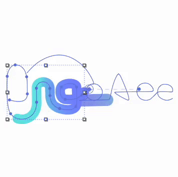
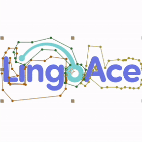
I also designed the logo animation for the company. I sketched the design in Procreate with my iPad and animated them in After Effects.
I made this because we have limited resources so sometimes I have to take care of them as side projects.
Example 2: Design and made the company logo animation with After Effects
Different tones of loading circle

Design the Mobile & Tablet App Store/Google Play Materials
Example: App store materials


Thoughts
Sometimes it's not the main work. but still enjoyable.
I came from small companies and had much experience as a digital designer before I became a product designer. So I have the skills to support the team. I do enjoy the process and when the resource is limited, I can save lots of time on those side projects and the progress doesn't need to get postponed that much.
Illustrate beforehand has more flexibility to design an app.
The visuals and styles always come with the material designs. Being comprehensive can help me imagine the app's actual view when I design it, even in an early stage, on exactly what the app really looks like.

