
Responsive Design System
@ LingoAce
My role:
-
Design System Designer
-
UX Engineer
Type:
Work Project
(In-progress)
Time:
Jul 2022 - Current
Team:
-
Head of Brand (1)
-
PM Lead (1)
-
PM (1)
-
Engineer Lead (1)
-
Engineer Team (5)
-
Market Team (?)
Background

Expand the oversea market
LingoAce is a edu-tech company established @2017. It grew rapidly during the pandemic. @2022, LingoAce wants to expand the oversea's market thus it wants to upgrade its brand identity, visual, user experience on its digital products.
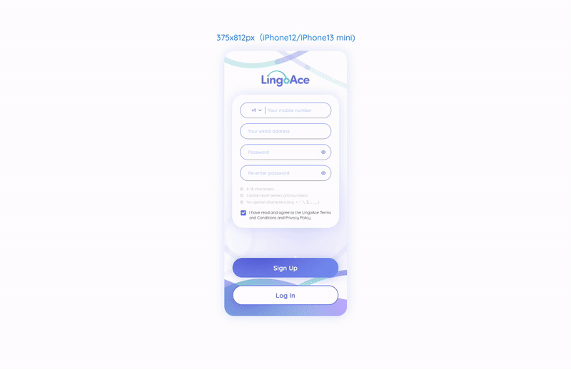
Design Mobile & Tablet App, and Design System
As the new Mobile/Tablet design received very positive feedback from customers and the internal team, our product team asked me to make a design system based on the new design to extend that to other platforms.
Because it's a big project involving UX research, UX design, visual design, design system design, responsive design, and material design, I will divide it into 3 parts on the website.

Responsive Design System
Strategy · Cross-Platform · iOS/Android · Tablet/Mobile · Front-End Dev· 2023
Cross-sea conversation with developers

Meet the develop team
Our design team is located in the U.S. and our development team is located in Beijing, China. On April 2023, I went to Beijing to meet our developers, to get to know their developing process, frameworks, technology constraints, priority, flexibilities, workload, and challenges, and discover some possible chances through the new Design System (View Project ↗).
Then I found ---
There are some great chances to improve the development process
Deliver re-usable design component library
When I first joined this team, we didn't have a design system to unify the entire design and development process. It caused many efforts to reinvent the wheel for both designers and engineers.
While upgrading the user experience and visual design, it also addresses many issues during the development process.
So I initiated a design system, created reusable materials, and set different statuses to fit different needs can significantly reduced repetitive work, and facilitated the development process.

Before
Develop page by page,
Re-invent the wheel.

After
Import on muti pages
re-used design materials
Delivered a Design System
200+
Icons
22
Font styles
28
Color styles
23
Interaction
Patterns
I organized the whole design file, and collect all the 200+ icons, 28 colors, styles of buttons, 22 fonts, and 23 interaction patterns (fill boxes, toggles, selectors, etc) into a Design System File and deliver to our developers.

A responsive framework that auto-fits arcoss
To deliver one package and fit onto different platforms cut half of the efforts on developments. Set the auto responsive framework can not only save developer's energy for developing something that's more interesting, intriguing like AI techs, but also will bring a smooth and consistent experience on different platforms.

Separated development doubles workload

One code package for
double platforms
Different platform, same logic
To keep the function logic & and user's experience consistent and can be systematically implemented, I mapped every page on both mobile and tablet respectively. This determines how different components and modules interact on both ends.
Take the 'Scroll' interaction as example:
1-colume scroll panel to 2 colume scroll panel

Define relative & absulute behaviors
In simple terms, it means defining how the same components behave on different hardware platforms, allowing these components to undergo both relative and absolute changes. This enables them to automatically adapt to various interfaces, reducing the long-term costs of development and design.
In the design, I use the 2-based (2, 4, 8, 16, 24, 36, 48, etc.) for scaling so that we could comfortably switch between px and dp.
Example: Using fixed/flexible areas to adapt to different platforms
Implement Responsive Design System
Deliver explicit specs on implementation
I made a detailed UI framework to elaborate the interaction and responsive details on each element, to guide our developers implement the product as exactly the design looks like.
Credits to the Figma new updates, more rich parameters like maximum and minimum specs can be added onto the components. So when developers copy paste the component specs, it will automatically included to the codes.
So I added these attributes directly onto Figma instead of have meetings that might cause lots of misunderstand and missed items, also prototypes to demonstrate the micro-interactions.
Containers general rules

Card layout general rules

Clarify different status of components
Example: HOME page student name bar truncate & specs details


Mark out important details
Tho Figma becomes more capable now but there're still some important factors that the developers might ignore. So I also list out the specific factors to call developer's attention, help them quickly get specs when they need to manually hard code.
Example: Container special specs of Mobile & Tablet


Fit into different languages
Due to our need to expand international business, multilingual support is also within the scope of interface considerations. Currently, we have versions available in French, Chinese, English, and Thai.
Recognizing that different languages have varying information entropy, in my design, I use longer languages (such as Thai or French) as a reference to leave more space for longer lines. This way, each line of text has some scalability to accommodate languages from different countries.
Different language panels
A
文

This design system is launching...
What I learn
Helping your stakeholders is essentially helping yourself.
The responsive design system was warmly welcomed by our development team and quickly made its way onto the schedule. In fact, this separate project wasn't initially within our scope. However, because I took into account the challenges faced by the development team in my design and helped address some of the issues they encountered, it received strong support from them and was swiftly implemented.
Before advancing a project, help colleagues understand it.
To my surprise, not many people know about the concept of Responsive Design, sometimes even stakeholders in the product team don't even know it. If I want to push the project forward, I need to popularize the concepts and benefits of a design system.
In this project I flew to Beijing to host several workshops with our developers and other peers on the design system, and got advocated by the developer lead, thus this project got moved forward. A playful intuitive file is very helpful. I guess I will keep the "Design System Playground File" always in hand and always get ready to help people recognize the Responsive Design System.

