
Green Card Bulletin Widget Design/Develop
@Ailaw
*A little story of the project*
During one of our monthly meetings with our partner law firm, an attorney said she had to jump because she needed to finish the Green Card bulletin report for all the applicants, which could take her 1 or 2 days to finish.
At that time I was learning Python. I helped her to crawl info from the USCIS website with my Python scripts... Just for practicing. But later then this little script functioned well so they asked me to keep going. Despite designing the interface, I was also the one to initiate a Python script to crawl data into excel, I then reorganized the data, and designed the data panel as a rough prototype.
Later then I got help from an engineer on the codes thus I can focus on the designs. We finally finished and launched this project in a month.
My role:
-
Product Designer /Developer
Type:
Work Project,
finished
Time:
07.2020 (1 month)
Team:
-
Product Manager
-
Engineer
Background


AILaw is a cloud-based legal technology platform that can greatly reduce repetitive and redundant labor work in non-litigation fields such as immigration petitions.
A tedious, time consuming work

Ease the process of Bulletin Report
For immigration lawyers, there’s a work called Bulletin Report. Attorneys will have to gather the updated information from the USCIS website for the Green Card candidates, analyze and report to them. It normally takes 1-2 days to finish this work per month.
In general, it's a must-do, time-consuming chore.
The major problems of this work are listed below:
Major Problems

For lawyers, only 35% of the page info is effective.
Effective Info.
01 Redundant contents
The USCIS website is not designed for people who frequently use it. It contains lots of interpretative information about the immigration policy. So for the lawyers, it contains too much redundant information.
This structure makes the information scattered so the reading experience is quite unsmooth.
And because of this structure, the effective information only takes a 35% percentage of the page.
Process of finding a special case's bulletin

02 Excessive Navigation Load
There are 5 steps to locate a bulletin change for a single case. It's almost impossible to have a quick comparison between different countries, visa types, time scales, and bulletin differences. If they do so, they have to navigate back to the first step to search for the information again.
So the Lawyers always need to have notes to record the bulletin change and analyze it.

Data format on the USCIS website
03 Unfriendly Data Format
If no one specific it, it's hard for viewers to cognize the date info from numbers and words in this way. And since the data don't store in a digital way, it's hard to calculate and analyze the data directly.
Develope Prototype 1.0
01 A quick idea I realize:
At that time I was learning Python crawler, so I quickly realized that it can help automate the process. We can simply crawl the static data and transfer that into digital format to facilitate calculations.

Manually gather data from the USCIS

Crawl data from the USCIS with scripts

Analysis data from scatted info

Display data in a friendly format
02 Initiate prototype 1.0
I wrote a simple Python script to crawl information and stored it in excel, also transformed it into digitals.
My early crawler of the prototype

03 Layer down data & Visualization design
And then I layered down the data and visualized it. There are 2 types of display for the data. One is the Gantt chart and the other is a combination of two charts.
The Gantt chart is pretty intuitive in that it can show the trend intuitively and easy to generate a single case report. But after rounds of discussion, we finally chose the second format. Because the Gantt chart cannot present multiple types of Visa in a single view. If the lawyer wants to report multiple visa cases, it will make the report too long. The combination of two charts can solve that. It can display multiple visa types at the same time and doesn't lose the trend details that much.
Layer-down the data gathered from USCIS

Research on different types of charts of data display

A quick data visual demo on Tableu

I showed this prototype to my boss back then, then I got help from an engineer in our company and he helped me optimize the code also followed my design, and code it out with Vue.JS.
Gather scattered information

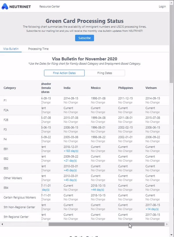
Reorganize the info and gather it on the same chart, so that users don't need to find information back and forth. It's convenient to compare info in different countries, different Visa types. And can quickly trace the previous year's data. Reconstructing data brings all information to the same page, it greatly reduces the navigation load.
Browse dates and view charts at the same time

Search the date and preview the chart at the same time. Users can now view charts without jumping around different pages.
Design and Launch
Intuitive info reading

Replace the unfriendly and confusing date formats with digits and chart format. Keep the data informative while reading easily and intuitively.
Responsive and Touch friendly
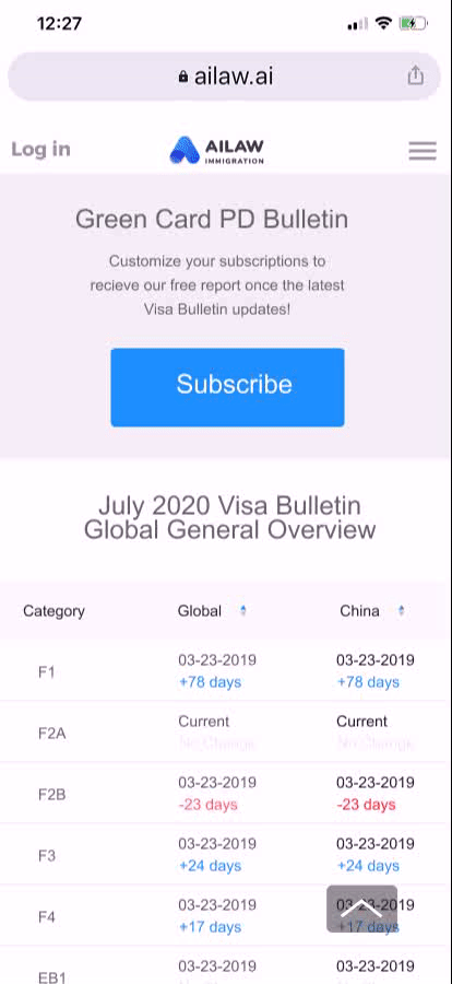
Supports touch friendly tap targets and responsive window handling. That means it’s great for big and little screens (and fingers) alike. It keeps the data display properly when using small screens.
After Design
We later on designed the function that will run the script every day to check if there's any update and if there is an update we will crawl it down into our database and send notification/email to our clients (lawyers).
This widget significantly reduces the checking process from 2 days to 10 seconds, automates the process of tracking, analyzing, reporting, sharing to both lawyers and Green Card candidates.
It gained 126 subscriptions from applicants and lawyers in the first week launched.
I left the company after it launched, and now it's still there. It seems didn't get updated after I left. To visit this project, click the button below.
What I learnt
A close look of front-end & back-end
This project allowed me to work closely with engineers directly on codes. I have learnt a lot of Python structures during this project, and am happy to see an actual project with my codes--not only with front-end but also back-ends.
A broader insight of a whole project
Also through this project, I got a chance to deeply dive into the structure of web application development and implementation of a web product. I expanded my view angle in this project and gained a broader insight into a whole product development level.
Insights into the problem-solving method
And also the most important thing is, it does help. I think for many people that need help, sometimes they don’t even realize that some work they were doing could be solved in this way. I think in the future, I really want to bring this problem-solving approach to help more people by listening to them.